You are browsing Nuxt 2 docs. Go to Nuxt 3 docs, or learn more about Nuxt 2 Long Term Support.
Going dark with Nuxt color mode
The @nuxtjs/color-mode module is a cool way of adding dark mode to your site. But not only does it switch from dark to light but also any color theme (eg. sepia mode). It even has auto detection so that it will choose the right mode depending on your system appearance.

The @nuxtjs/color-mode module is a cool way of adding dark mode to your site. But not only does it switch from dark to light but also any color theme (e.g.: sepia mode). It even has auto detection so that it will choose the right mode depending on your system appearance.
- How does it work
-
Let's get started
- Install the color-mode module
- Adding your color styles
- Inspecting the HTML
- Creating a color-mode switcher
- Importing our component
- Adding a click event to change our colors
- Adding some icons
- Importing the SVGs as components
- Adding a dynamic component
- Styling our icons
- Creating a method to show our preferred class
- Adding some text using the ColorScheme component
- Adding a text when system is chosen
- Tidying up our styles
- Conclusion
- What to do next
How does it work
The @nuxtjs/color-mode adds a .${color}-mode class to the <html> tag. It works with any Nuxt target, either static or server and universal or client-side rendering. It auto detects the system color-mode so that you don't have to manually change the color.
It injects a $colorMode helper with:
-
preference: Actual color-mode selected (can be'system'), update it to change the user preferred color mode -
value: Useful to know what color mode has been detected when$colorMode === 'system', you should not update it -
unknown: Useful to know if, during SSR or static generation, we need to render a placeholder
Let's get started
You can work on an already created project or start a new one. For this example I have created a new project and added some dummy text to the index.vue file in the pages folder.
<template>
  <h1>Testing color mode</h1>
</template>
Install the color-mode module
First of all you need to install the module as a dependency to your Nuxt project.
yarn add --dev @nuxtjs/color-mode
npm install --save-dev @nuxtjs/color-mode
Then you need to add the module to the buildModules section of your nuxt.config.js file.
export default {
  buildModules: ['@nuxtjs/color-mode']
}
If you using a version of Nuxt lower than 2.9.0 you will need to add it to the modules property instead of buildModules.
yarn nuxt -v or npm run nuxt -vAdding your color styles
Now you need to add some styles to your mode classes. Let's add a main.css file in our assets folder. We will use CSS variables to set the root color which will be light mode and then set the colors for dark and sepia mode. Then we can add some styles to our body and link tags.
:root {
  --color: #243746;
  --color-primary: #158876;
  --color-secondary: #0e2233;
  --bg: #f3f5f4;
  --bg-secondary: #fff;
  --border-color: #ddd;
}

.dark-mode {
  --color: #ebf4f1;
  --color-primary: #41b38a;
  --color-secondary: #fdf9f3;
  --bg: #091a28;
  --bg-secondary: #071521;
  --border-color: #0d2538;
}
.sepia-mode {
  --color: #433422;
  --color-secondary: #504231;
  --bg: #f1e7d0;
  --bg-secondary: #eae0c9;
  --border-color: #ded0bf;
}

body {
  font-family: -apple-system, BlinkMacSystemFont, 'Segoe UI', Roboto, Oxygen,
    Ubuntu, Cantarell, 'Open Sans', 'Helvetica Neue', sans-serif;
  background-color: var(--bg);
  color: var(--color);
  transition: background-color 0.3s;
}
a {
  color: var(--color-primary);
}
In order to use this CSS file in our application we need to register it. We do this by adding a css property to our configuration file and adding the css file that we have just created.
css: ['@/assets/main.css']
Inspecting the HTML
Now if you launch your site with npm run dev or npx nuxt dev you should see dark mode if your system is already set to dark mode and if you inspect the code you will see the class added to your html tag.
<html class="dark-mode">
  // you might have light-mode here
</html>
Using the dev tools change the mode to sepia-mode and light-mode to see the effects.
<html class="sepia-mode">
  <!-- or -->
  <html class="light-mode">
    <!-- or dark mode if you have already seen the light -->
  </html>
</html>
You can also change the color in the console by typing:
$nuxt.$colorMode.preference = 'sepia'
Creating a color-mode switcher
Obviously changing the mode in the dev tools is not what we want so let's create a color-mode switcher so our users can quickly change from one color to another.
Let's create a component called ColorModePicker and we can add a list of colors. For now we can just print out the color from our v-for.
<template>
  <div>
    <ul>
      <li v-for="color of colors" :key="color">
        {{color}}
      </li>
    </ul>
  </div>
</template>
And in our data property let's return an array of colors for each mode.
<script>
  export default {
    data() {
      return {
        colors: ['system', 'light', 'dark', 'sepia']
      }
    }
  }
</script>
Importing our component
Let's import our component into our index.vue page so we can see what is happening.
<template>
  <ColorModePicker />
</template>

<script>
  import ColorModePicker from '@/components/ColorModePicker'

  export default {
    components: {
      ColorModePicker
    }
  }
</script>
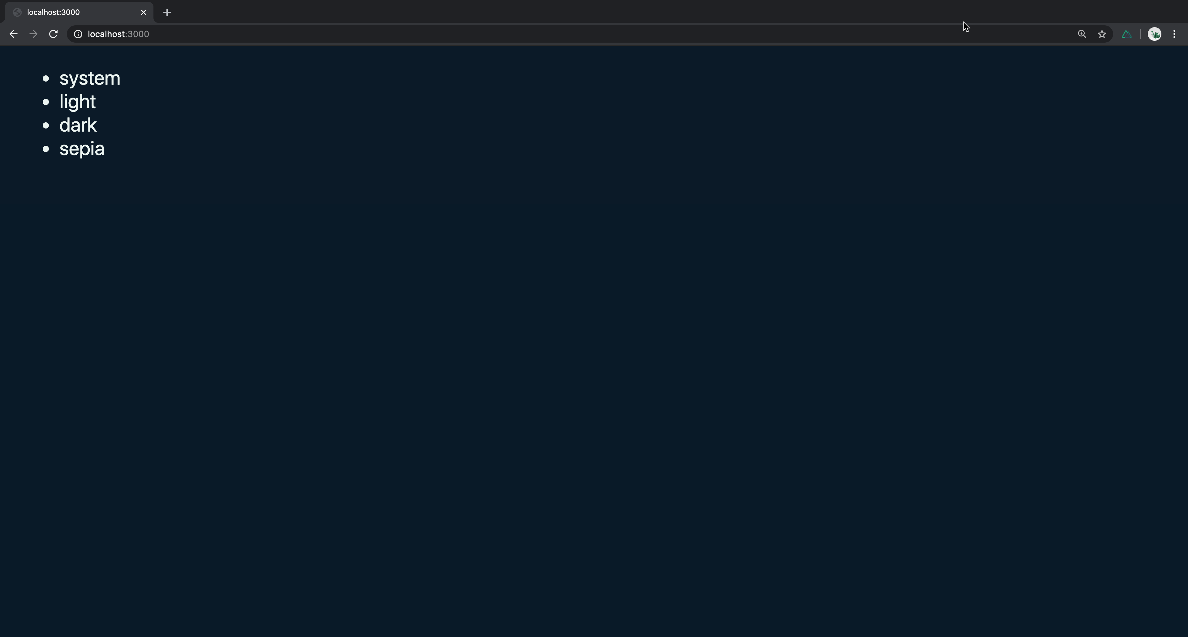
And in our browser under http://localhost:3000 you will see our list of colors.

Adding a click event to change our colors
Then in our template we can add a click event that will make the $colorMode.preference equal to the color which comes from our data.
We can use our $colorMode helper that we get with the color-mode module. When the user clicks the $colorMode.preference will be set to the color coming from our data.
<li
  v-for="color of colors"
  :key="color"
  @click="$colorMode.preference = color"
></li>
This is actually all you need in order for it to work. If you check in your browser you will see that by clicking on any of the colors the background is changing. It probably won't have a pointer cursor so if you think it doesn't work it probably does just you are used to seeing the cursor.
And if we check in the browser we can see it works but this is super ugly. Let's tidy it up a bit.
Adding some icons
Let's add some icons. you can copy the icons from here and place them in your assets folder in a new folder called icons.
We are going to use our icons as a component and in order to do that we will use the @nuxtjs/svg module which allows you to import .svg files in multiple ways depending on the resource query you provide.
First you will need to install it
yarn add --dev @nuxtjs/svg
# OR npm install --save-dev @nuxtjs/svg
Then we need to add it to your nuxt.config.js in the buildModules section which should already have the @nuxtjs/color-mode module.
buildModules: ['@nuxtjs/svg', '@nuxtjs/color-mode']
Importing the SVGs as components
We can now import these svg icons as components using the ?inline query so that they are imported as inline SVGs.
<script>
  import IconSystem from '@/assets/icons/system.svg?inline'
  import IconLight from '@/assets/icons/light.svg?inline'
  import IconDark from '@/assets/icons/dark.svg?inline'
  import IconSepia from '@/assets/icons/sepia.svg?inline'

  export default {
    components: {
      IconSystem,
      IconLight,
      IconDark,
      IconSepia
    },
    // ... data property will be here
</script>
Adding a dynamic component
Now we can use a dynamic component which will check which icon to add depending on the colors in our data array. Lets replace the {{color}} text with this new component inside our <li>.
<component :is="`icon-${color}`" />
Let's move our click event from our <li> to our icon component.
<component :is="`icon-${color}`" @click="$colorMode.preference = color" />
Styling our icons
And let's add some styles so we can see our icons. We will use scoped styling and use the class feather. If you look into your svg files you will see that our SVGs have the class of feather so we can use this class to style it. We will also add a preferred and selected class so we know which one has been selected and what is the preferred one.
<style scoped>
  .feather {
    position: relative;
    top: 0px;
    cursor: pointer;
    padding: 7px;
    background-color: var(--bg-secondary);
    border: 2px solid var(--border-color);
    margin: 0;
    border-radius: 5px;
    transition: all 0.1s ease;
  }
  .feather:hover {
    top: -3px;
  }
  .feather.preferred {
    border-color: var(--color-primary);
    top: -3px;
  }
  .feather.selected {
    color: var(--color-primary);
  }
</style>
You won't see much difference right now except that the icons look a bit nicer but now we need to show a different class for our preferred icon which comes from our system preference and one for our selected icon which is for when we use the click event to change the color.
Creating a method to show our preferred class
To do this we can create a method that will return the class we want. We can call our method getClasses and pass in the color as the parameter The two classes we want to return are preferred and selected. The preferred color should be equal to the $colorMode.preference and the selected color should be equal to the $colorMode.value. If the colorMode is unknown we can return an empty object.
data () {
  return {
    colors: ['system', 'light', 'dark', 'sepia']
  }
},
methods: {
  getClasses (color) {
    // Does not set classes on ssr when preference is system (because we don't know the preference until client-side)
    if (this.$colorMode.unknown) {
      return {}
    }
    return {
      preferred: color === this.$colorMode.preference,
      selected: color === this.$colorMode.value
    }
  }
}
We can now add this class to our icon component. The class will call the getClasses method passing in the color we receive when we use the click event.
<component
  :is="`icon-${color}`"
  @click="$colorMode.preference = color"
  :class="getClasses(color)"
/>
And you will see in the browser the colors are being applied just as we wanted. But it is not very clear when we click the system icon what is going on.
Adding some text using the ColorScheme component
Let's add something that can help the user understand it.
If you are doing SSR (nuxt start or nuxt generate) and if $colorMode.preference is set to 'system', using $colorMode in your Vue template will lead to a flash. This is due to the fact that we cannot know the user preferences when pre-rendering the page since they are detected on client-side.
To avoid the flash, we have to guard any rendering path which depends on $colorMode with $colorMode.unknown to render a placeholder or use our <ColorScheme> component.
Let's create a ColorScheme component under our <ul> with a placeholder and a tag of span. Inside it we can add some text and display the $colorMode.preference which we receive from the color-mode module.
<ColorScheme placeholder="..." tag="span">
  Color mode: <b>{{ $colorMode.preference }}</b>
</ColorScheme>
You will now see in the browser that if you change the icon the text will appear that corresponds to the icon clicked.
Adding a text when system is chosen
We can improve this further by seeing when the preference is the system and adding another message that shows which value was detected.
<ColorScheme placeholder="..." tag="span">
  Color mode: <b>{{ $colorMode.preference }}</b>
  <span v-if="$colorMode.preference === 'system'"
    >(<i>{{ $colorMode.value }}</i> mode detected)</span
  >
</ColorScheme>
If you test it out in the browser you will see it's looking pretty good and we are almost there.
Tidying up our styles
We now just have to tidy up a few styles. Let's get rid of the dots from the <ul> and add some spacing and some style to our <p> tag.
ul {
  list-style: none;
  padding: 0;
  margin: 0;
}
ul li {
  display: inline-block;
  padding: 5px;
}
p {
  margin: 0;
  padding-top: 5px;
  padding-bottom: 20px;
}
And in order to center it we can wrap our ColorModePicker component in a div with the class of container.
<div class="container">
  <ColorModePicker />
</div>
And add the styles to the container class in our styles
<style scoped>
  .container {
    text-align: center;
    padding: 50px;
  }
</style>
Conclusion
And there you have your beautiful and fully working color-mode component. Feel free to have some more fun by changing the icons or adding more colors or modifying the color scheme. Have fun.